How to Create a Dashboard Report in Dynamics NAV 2013 R2
Velosio||
Get a step-by-step overview to creating a dashboard report in Microsoft Dynamics NAV 2013 R2
Table of Content
SHARE
SHARE
Microsoft Dynamics NAV 2013 R2 has the added visualization benefits of a dashboard style reporting system so that you can see at a glance, important pieces of information about your business processes. It is necessary to understand all of the new features within Dynamics NAV 2013 R2 to be able to take advantage of all that it has to offer. Here are some easy steps to get you up and running with creating a more effective dashboard report within Dynamics NAV 2013 R2.
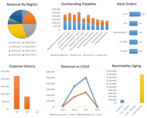
Step 1: Prepare the DataSet based upon a cue table – Within the Role Center – Sales Order Processor, you can see activities panels with important data to use for reports.
Step 2: Add Chart controls to Customize Chart(s) to visualize the information – Insert a chart in to your report, you may pick from many different chart layouts depending on what will work best for the information you are showing. Select your variables that have been added from the cue tables. Then adjust the title and variable names within the legend.
Step 3: Add Gauge Panel(s) and Customize Gauge Panels to further enhance the report – Introduce gauge controls in order to further enhance and specify your data. Just like a gauge on the dashboard of your car, you simply get the information that is most important to you at that time. You can change the labels, number scale, colors, fonts, and many other properties of your gauge panels. Combining the gauge panels with the charts can give you a better understanding of the ratios.
Step 4: Prepare the DataSet that contains information on items and their inventory or remaining quantity by specific location and visualize that information by creating a matrix control – Use SQL Server Report Builder to create the layout of the report.
Step 5: Add an indicator and Sparkline control to enhance the layout of the report to visualize and compare reorder points and posting dates – Include an indicator control within the DataSet and pull the inventory which is the sum of the remaining quantity of items. Use numerical values with two lines to compare the inventory with the reorder point of the item. Insert another column for the Sparkline. Show inventory quantity and posting dates to give you a trend line of what is going on regarding posting dates for the item. Adjust colors and line thickness as you like.
Step 6: Further enhance the report by adding an expression for column colors – Store the colors you want to use for each column within the database of Dataset. Change color of background that pulls the color from the location of the inventory. To get a background color even if there is not data in that particular cell, use rectangle control with multiple text boxes within it. Apply the color to the indicator column and Sparkline for each location as well. And finally, apply a color to total rows and heading rows.
SHARE
On-Premises Dynamics
Ready to take action?
Talk to us about how Velosio can help you realize business value faster with end-to-end solutions and cloud services.
 Microsoft Dynamics NAV 2013 R2 has the added visualization benefits of a dashboard style reporting system so that you can see at a glance, important pieces of information about your business processes. It is necessary to understand all of the new features within Dynamics NAV 2013 R2 to be able to take advantage of all that it has to offer. Here are some easy steps to get you up and running with creating a more effective dashboard report within Dynamics NAV 2013 R2.